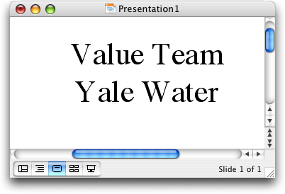
Here is one reason of many that PowerPoint makes you look like a total amateur: it cannot kern fonts. Just look at the distance between the initial capital letters and the rest of the words below. ‘Yale’ is the most egregious example, and utterly embarrassing if you're representing Yale and this horrid bit of text appears on your title slide. No, there is not a space character between the ‘Y’ and the ‘a’… PPT just renders it that way.
The default way to lay out letters digitally is to use the bounding box of each letter. Just imagine the smallest rectangle that encloses the whole letter. And then stack those rectangles together like books on a shelf. This works for most pairs of letters, but sometimes they look terrible that way.
To fix this, all digital fonts contain information about pairs of letters that should be moved slightly closer together than they would otherwise appear. This is called kerning. Digital fonts have been designed with kerning pairs, and computers have set type with them, since at least the 1970s. And here it is 30 years later… I guess Microsoft didn't get the memo.
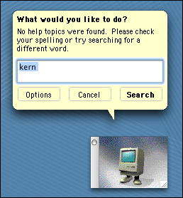
The strange thing is, Microsoft Word can kern the fonts, but inexplicably it is turned off by default. You have to go into the menus and ask for it. If I ask PowerPoint about kerning, it draws a total blank:
Now, you may argue that people who have not studied typography or design won't notice this. So, using PowerPoint would only make you look like an amateur designer to other designers, not an amateur computer scientist or chemist or management consultant.
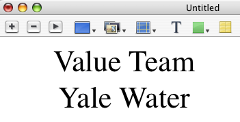
But I believe this is dead wrong. People who haven't studied design can't identify problems like this, but I'm pretty sure they notice them at some level. An audience member will come away thinking my visual aids are very professional looking and yours are crappy. He doesn't necessarily know whether it was the layout, the color scheme, the choice of font, or the software itself. But the impression left by your visual aids will certainly impact your message. Here is the same text, set in the same size, in Apple's Keynote software. Notice that the ‘e’ is tucked slightly under the ‘T’ in ‘Team’.
I rant about this problem to myself whenever I see it on someone else's slides, which is basically whenever I attend a talk. I was prompted to post this today because we had an awards ceremony for students last night, and I had to stare at the word “V aledictorian” in PowerPoint for a while.
Say no to PowerPoint, or at least start bugging Microsoft to fix this!


