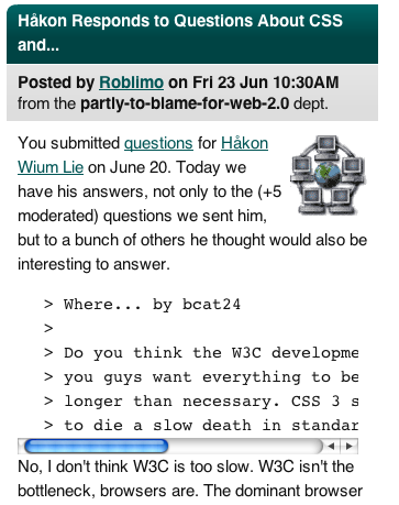
I was looking forward to reading a Slashdot interview with Håkon Wium Le, the inventor of Cascading Style Sheets. Unfortunately, the way the page was rendered, each question was in a monospaced typeface in a little pre-formatted window with a horizontal scroll bar. The horror! If this is what CSS buys us, I want nothing to do with it! :)

Now, though, the capabilities of CSS are somewhat respectable. Sometimes I think it would be helpful to support a notion of ‘glue’ like in TeX. Glue is space that has a natural size, but can potentially shrink and expand as needed, within specified parameters. Or at least, I'd like to be able to specify a width as “3em + 5px,” since one of these measurements is relative to the current font size, and the other isn't.
I haven't really looked yet at what is in CSS3; maybe I should.